The Evidence-Based Investor

Tag Archive: elm partners

  1. The cost of anticipating corrections

    Comments Off on The cost of anticipating corrections


    By LARRY SWEDROE


    The sharp rally in the S&P 500 Index from the March 23, 2020, close of 2,237 to the close on April 20 of 2,823 has led to my being asked about whether it’s now a good time to wait for a “correction” (implying the market is mispriced and is in need of correcting). My own personal view (on which I never rely to make investment decisions because I know I cannot forecast any better than the market) is that I’m surprised that the S&P 500 is down only about 12% when earnings are forecast to fall by much more than that.

    Most of the forecasts I’m hearing from leading economists are in the area of 20%. And the error rate around that forecast is now much higher than before the crisis. I also note that such forecasts are notoriously optimistic. For example, the study Why So Much Error in Analysts’ Earnings Forecasts? found that the average consensus growth rate forecast was more than twice the actual rate. That said, should you wait for that correction? Let’s turn to the historical evidence so we can make an informed decision.

    We have data for 94 calendar years (or 1,128 months) of U.S. investment returns over the period 1927 through March 2020. The average monthly return to the S&P 500 was 0.94%, and the average quarterly return was 2.9%.


    Take this quiz

    With that background, here’s a short, four-question quiz:

    1. If we remove the returns from the best 94 months (an average of just one month a year and 8.3% of the entire period), what is the average return of the remaining 1,034 months?

    2. What is the average return of those best-performing 94 months?

    3. If we remove the returns of the best-performing 94 quarters (an average of one quarter a year and 25% of the entire time period), what is the average return of the remaining 282 quarters?

    4. What is the average return of those best-performing 94 quarters?


    What many investors don’t know is that most stock returns come in very short and unpredictable bursts, which is why Charles Ellis offered this advice in his outstanding book Investment Policy: “Investors would do well to learn from deer hunters and fishermen who know the importance of ‘being there’ and using patient persistence — so they are there when opportunity knocks.”


    What Does Warren Buffett say?

    It also is likely why, in his 1991 annual report to shareholders, legendary investor Warren Buffett told investors, “We continue to make more money when snoring than when active” and “Our stay-put behaviour reflects our view that the stock market serves as a relocation centre at which money is moved from the active to the patient.” Later, in his 1996 annual report, Buffett added: “Inactivity strikes us as intelligent behaviour.”


    The answers to the quiz

    1. While the average month returned 0.94%, if we eliminate the best-performing 94 months, the remaining 1,034 months provided an average return of virtually zero (0.1%). In other words, 8.3% of the months provided almost 100% of the returns.

    2. The best-performing 94 months, an average of just one month a year, earned an average return of 10.4%.

    3. While the average quarter returned 2.9%, if we eliminate the best-performing 94 quarters, the remaining 282 quarters (three-fourths of the time period) actually lost money, providing an average return of -0.8%. In other words, just 25% of the period provided more than 100% of the returns.

    4. The best-performing 94 quarters, an average of just one quarter a year, earned an average return of 14.1%.


    Despite this type of evidence, which makes clear how difficult market timing must be, one of the most popular beliefs held by individual investors is that timing stock markets is the winning strategy. After all, who doesn’t want to buy low, right at the end of a bear market, and sell high, just before the next bear market begins? Unfortunately, an idea is not responsible for the people who believe in it.


    Pros are bad at prediction

    The evidence is very clear that professional mutual fund managers cannot predict the stock market. For example, in his famous book A Random Walk down Wall Street, Burton Malkiel cited a Goldman Sachs study that examined mutual funds’ cash holdings for the period 1970 through 1989. In their efforts to time the market, fund managers raise cash holdings when they believe the market will decline and lower cash holdings when they become bullish. The study found that, over the period it examined, mutual fund managers miscalled all nine major turning points.

    Legendary investor Peter Lynch offered yet another example. He pointed out that an investor who followed a passive investment strategy and stayed fully invested in the S&P 500 over the 40-year period beginning 1954 would have achieved an 11.4% rate of return.

    If that investor missed just the best 10 months (2% of them), his return fell 27%, to 8.3%. If the investor missed the best 20 months (or 4% of them), his return dropped 54%, to 6.1%. Finally, if the investor missed the best 40 months (or just 8% of them), his return declined 76%, all the way to 2.7%.

    In a September 1995 interview with Worth magazine, Lynch put it this way: “Far more money has been lost by investors in preparing for corrections, or anticipating corrections, than has been lost in the corrections themselves.”

    Investors should keep the preceding evidence in mind — as well as advice against trying to time the market offered by investment legends such as Ellis, Buffett and Lynch — whenever they hear warnings from “gurus” that the market is overvalued and more of a correction is surely coming.


    The cost of waiting

    Elm Partners provided some valuable insight into the question of whether investors should wait to buy equities because they believe valuations are too high. Looking back at 115 years of data, Elm asked: “During times when the market has been ‘expensive,’ what has been the average cost or benefit of waiting for a correction of 10% from the starting price level, rather than investing right away?” It defined “expensive” as the occasions when the stock market had a CAPE ratio more than one standard deviation above its historical average.

    Elm noted that while the CAPE ratio for the U.S. market is currently hovering around two standard deviations above average, there aren’t enough equivalent periods in the historical record to construct a statistically significant data analysis. It then focused on a comparison over a three-year period, a length of time beyond which they felt an investor was unlikely to wait for the hoped-for correction. Following are its key findings:

    — From a given “expensive” starting point, there was a 56% probability that the market had a 10% correction within three years, waiting for which would result in about a 10% return benefit versus having invested right away.

    — In the 44% of cases where the correction doesn’t happen, there’s an average opportunity cost of about 30%—much greater than the average benefit.

    — Putting these together, the mean expected cost of choosing to wait for a correction was about 8% versus investing right away.


    The key takeaway

    The key takeaway is this: Even if you believe the probability of a correction is high, it’s far from certain. And when the correction doesn’t happen, the expected opportunity cost of having waited is much greater than the expected benefit.

    Elm offered the following explanations for why it thought the perception exists among investors that waiting for a correction is a good strategy:


    “First, while a correction occurring is indeed more likely than not, investors may confuse the chance of a correction from peak-to-trough with the lower chance of a correction from a fixed price level.  For example, the historical probability of a 10% correction happening any time during a 3-year window is 88%, significantly higher than the 56% occurrence of that correction from the market level at the start of the period.

    “Second, the cost of waiting and not achieving the correction is a ‘hidden’ opportunity cost, and we humans have a well-documented bias to underweight opportunity costs relative to realised costs.

    “Finally, investors may believe they can wait indefinitely for the correction to happen, but in practice few investors have that sort of staying power.”


    Elm repeated its analysis with correction ranges from 1% to 10%, time horizons of one year and five years, and an alternate definition for what makes the market look “expensive” (specifically, waiting for a correction from times when the market was at an all-time high at the start of the period).

    The firm found that “across all scenarios there has been a material cost for waiting. The longer the horizon that you’d have been willing to wait for the correction to occur … the higher the average cost.”


    Summary

    More money is lost anticipating corrections than in them.

    As the author Peter Bernstein once said, “even the most brilliant of mathematical geniuses will never be able to tell us what the future holds. In the end, what matters is the quality of our decisions in the face of uncertainty.”

    We certainly live in uncertain times. But that’s always the case. To help stay disciplined, it’s important to keep in mind that the market already reflects whatever concerns you may have.

    Finally, remember this further advice from Warren Buffett: “The most important quality for an investor is temperament, not intellect.” The inability to control one’s emotions in the face of uncertainty, and clarion cries of overvaluation, help explain why so few investors earn market rates of return and thus fail to achieve their objectives.


    LARRY SWEDROE is Chief Research Officer at Buckingham Strategic Wealth and the author of numerous books on investing.
    Want to read more of Larry’s insights? Here are his most recent articles published on TEBI:

    Markets are more efficient than you think

    More proof that consultants can’t pick winning funds

    Active fund performance in the COVID crisis

    Hedge fund fees are much worse than you thought

    The twenty dollar bill

    Index funds 43 College endowments 0

    Are covered calls too good to be true?


    Good financial advice is worth paying for

    Did you know that TEBI can now put readers in touch with an evidence-based financial adviser in their area?

    If you’re looking for advice on your investments or on your financial situation in general, simply click on this link and enter your name and email address. You will then be sent a short questionnaire to complete. Your answers will enable us to identify a suitable firm for you to speak to.

    We will only recommend advisers who share our evidence-based investment philosophy and who we know and trust. If we can’t help you we will tell you.


    © The Evidence-Based Investor


  2. The problem with net worth as a measure of wealth

    Comments Off on The problem with net worth as a measure of wealth


    By VICTOR HAGHANI and JAMES WHITE


    “Mr Darcy soon drew the attention of the room by his fine, tall person, handsome features, noble mien, and the report which was in general circulation within five minutes after his entrance, of his having ten thousand a year.

    – Jane Austen, Pride and Prejudice (1813)


    These days we tend to assess our net worth by tallying up the market value of our financial assets, even though it might be more natural to think of our wealth as a stream of dollars over time given the nature of our income and spending. Perhaps this fixation on lump sum wealth is induced by the media. You won’t find Elon Musk on any rich list appraised at $1 billion per year, even though that’s about what his $40 billion of stock holdings would be worth in annuity form. But if you see your savings as a means to the end of future spending and bequests, the per-year measure seems more appropriate.


    “Real Annuity Value”

    Let’s entertain the idea that what we really care about is the long-term, inflation-adjusted purchasing power which $1 can lock in today — we’ll call this the “Real Annuity Value” of $1.2 This shift in perspective has some pretty big implications for how we save and invest.

    For one, we have to rethink the notion that T-bills and other cash proxies, such as money market funds and bank deposits, are the lowest-risk assets we can own. While it’s true that the nominal value of T-bills doesn’t go up or down much day to day, we’ll see them as dramatically more risky once we focus on their Real Annuity Value.

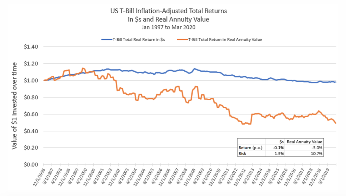
    The chart below shows the ‘real’ (i.e. inflation-adjusted) total return history of T-Bills, in terms of both dollars and Real Annuity Value:


    As you can see, in dollars T-Bills had very low risk as well as very low real total return. Not so when looking at their performance expressed in Real Annuity Value: if you were invested in T-Bills over the whole period, by the end you could only buy half the Real Annuity you could have bought at the beginning. That’s a really significant loss of long-term purchasing power for a supposedly low-risk investment.

    The much lower Real Annuity Value delivered by T-bills is not a result of inflation, which we’re accounting for. Instead, it’s because long-term real interest rates, which set the payout of real annuities, dropped from 3.75% in 1997 to about 0% today. Looking further back in time, investments in US T-bills lost about 33% and 40% respectively of their Real Annuity Value over 1916 – 1920 and 1940 – 1948.3

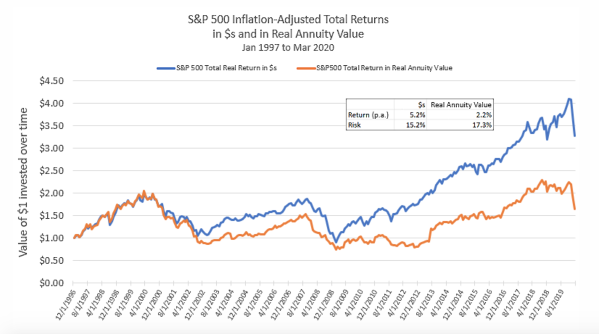
    Now let’s do the same comparison for the S&P 500:


    We see that, while the total returns differ, equities are about as equally volatile measured in dollars or in Real Annuity Value. T-Bills lost about 50% of their Real Annuity Value, while equities gained about 50% – respectable, though far less than their dollar gains of over 200%.

    It’s easy to read too much into these charts over any given period, but one interpretation is that equities are intrinsically a bit like a real annuity themselves: they provide an indefinite stream of earnings, which naturally adjust somewhat to inflation. They’re risky and have a volatile risk premium relative to the Real Annuity Value, but nonetheless they’re more like a real annuity than T-Bills are.4


    Conclusion


    “Our approach to saving is all wrong: We need to think about monthly income, not net worth.”

        – Robert C. Merton, Harvard Business Review (2014)


    We’ve seen that T-Bills and similar cash-like assets are significantly more risky in terms of Real Annuity Value than they appear when viewed in plain dollars. Given their generally low expected real return, this makes cash-like assets look pretty unappealing to hold in excess of amounts needed to cover near-term expenses and contingencies.

    In contrast, equities are not significantly more risky in this new light, and may be even more attractive if we believe the long-term expected earnings streams they generate makes them a form of a long-term, real annuity. In our recent note Taking Stock, we found that the stock market currently looks more attractive viewed from the Real Annuity Value perspective, both prospectively and relative to historical valuations.

    Back in Jane Austen’s day, wealth was harder to value and less liquid than it is today — one reason why it was more common to think about it as an annual flow, rather than an upfront value. While it’s more straightforward to measure your investment portfolio as a current lump sum value, a significant fraction of most peoples’ financial resources — their human capital and future social security and pension benefits — are much more readily thought of as long-term real annuities.

    If you see your wealth as a reservoir for long-term future consumption, we think it’s well worth the extra mental effort to think about all your financial resources and decisions with the Real Annuity Value perspective.


    Appendix: Real annuity value mechanics

    Once we start measuring financial well-being in terms of long-term annual purchasing power, we’ll need to identify a new risk-free asset to take the place of T-bills.5 What we need is an asset that pays a real $1 per year for many years, and with the highest assurance of payment possible. US Government Treasury Inflation-Protected bonds (TIPS) are a pretty good candidate, even though their cash flows aren’t quite in the form of a long-term real annuity due to their principal repayment at maturity.

    Improving upon TIPS as our risk-free asset to generate the historical return charts in this note, we constructed a new currency: the RA-$ (for Real Annuity Dollar) which represents $0.02 per year for the next 50 years, adjusted for inflation. The value of the RA-$ will fluctuate versus the regular Dollar, driven by long-term real interest rates, which we can get from the market pricing of TIPS.

    Since long-term real interest rates are about zero right now, the value of RA-$1 currently would be equal to about $1, as 2 cents per year, inflation-adjusted for 50 years equals $1 discounted at a zero real interest rate. In early 1997, at the start of the period in our chart, long-term real interest rates were about 3.75%, making the value of RA-$1 about $0.50 regular Dollars.

    Prior to 1997 — when the US Treasury started issuing TIPS — the notion of Real Annuity Value and RA-$’s would have been purely hypothetical. Over the past 20 years, experts in personal finance such as Robert Merton, Zvi Bodie and John Campbell that argue the Real Annuity Value framework is the most consistent and logical one for reaching sound personal financial decisions. Investors, it has been suggested, should adopt TIPS as their minimum risk asset in lieu of T-bills and other cash-like investments. If investors were to embrace this shift in perspective more broadly, the long-term TIPS market would have to grow well beyond its current size of $215 billion. That sum is less than 1% of the total US Treasury and investment grade bond market.


    Further reading and references


    [1] This not is not an offer or solicitation to invest, nor should this be construed in any way as tax advice. Past returns are not indicative of future performance.

    Thank you to Bob Merton for his suggestions and for sharing his thoughts on this topic, to which his decades of research and writing have contributed so much. Thanks also to Vlad Ragulin (one of Bob’s many students) and Rich Dewey for their valuable comments.

    [2] An annuity is a fixed sum of money paid each year, typically for a long period of time. A real annuity pays a fixed inflation-adjusted sum of money each year. US Social Security payments can be thought of as a real annuity, with a start date at entitlement age.

    [3] As per data made available by Professor Robert Shiller here. We assume that the level of real rates did not change over these two periods. Nominal rates changed little, and unfortunately long-term real rate data does not exist for those time periods.

    [4] A laddered portfolio of US Treasury Inflation-Protected Securities (TIPS) are the most like a real annuity that an investor could buy, and is a good candidate for the minimum risk asset an investor can buy.

    [5] In this note, we focus on a risk-free Real Annuity as a benchmark and numeraire for assessing one’s financial resources and making investment decisions. However, an even more accurate metric would take account of the expected return and risk of the full investment opportunity set as well as one’s personal aversion to risk. Such a measure would use the long-term risk-adjusted return of an investor’s desired portfolio instead of the long-term risk-free real rate to compute the Real Annuity Value to be used as one’s personal numeraire.


    VICTOR HAGHANI is founder and CIO of Elm Partners, and JAMES WHITE is the CEO.


    Picture: Elizabeth Bennet Overhears Mr Darcy At The Ball. Illustration by Hugh Thomson from the 1894 edition of Jane Austen’s Pride and Prejudice.


  3. Can better investing reduce wealth inequality?

    Comments Off on Can better investing reduce wealth inequality?


    By VICTOR HAGHANI, JEFFREY ROSENBLUTH and JAMES WHITE


    Understanding the origins of wealth inequality is critical in the debate over what, if anything, to do about it. In this note, we propose a simple model which is still rich enough to reproduce observed patterns of wealth inequality. We call it the Concentrated Asset Betting (CAB) model. A key element of CAB is a phenomenon known in the gambling world as “over-betting the edge.” Our approach was inspired by Bruce Boghosian’s Scientific American article “Is Inequality Inevitable?”  which provides an introduction to a straightforward model of wealth inequality called the “Yard Sale Model” (YSM).

    In a Yard Sale model, it is assumed that people enter into repeated exchanges with each other. In each exchange one party is chosen at random to be the “winner” and one the “loser.” The absolute size of the exchange is determined by the assets of the less wealthy party. As the number of exchanges increases, the model converges to one person having all the money in the economy. To match observed levels of wealth inequality in different countries at different times, the YSM is then extended to include wealth redistribution and a couple of other enhancements.


    Model description

    The model we propose is based on the observation that a high fraction of investors have experienced sub-par growth in their savings, after allowing for consumption and philanthropy, relative to the tremendous long-term growth in the public stock market. Victor presented some anecdotal evidence of this in his TEDx talk, “Where Are All the Billionaires and Why Should We Care?”  Some of the reasons put forward to explain the shortfall in investor returns include investment fees, commissions and taxes. Our model suggests there may be something even larger and more insidious at work – pervasive and systematically poor money management. Here, money management means the task of sizing and diversifying the risks of a portfolio of investments.

    Numerous academic studies have documented the tendency of investors to hold significantly undiversified portfolios, especially in the pre-Vanguard era up to the early 1990s. With commissions of $70 or more per trade, investors had an incentive to minimise the number of individual stocks they held. [1] A study by Vanguard observed that from the 1950s through the 1980s investors’ equity exposure came almost entirely through directly-held stocks, and the median investor held only two stocks. [2]

    The most basic version of our model begins with a population of households all with the same initial wealth. Each household starts off fully-invested in one stock. [3] If their wealth increases, they increase the number of stocks they own, thereby increasing their diversification. We add one stock to their portfolio each time their wealth doubles. Each portfolio is split equally among however many stocks they own, rebalancing monthly.

    Every stock has an annual expected return of 6%, which roughly matches the US stock market’s annual price appreciation over the past hundred years. [4] We assume a 19% standard deviation of monthly returns, consistent with Hendrik Bessembinder’s large-scale study “Do Stocks Outperform Treasury Bills?”  For simplicity, we assume the stocks are uncorrelated with each other. [5]

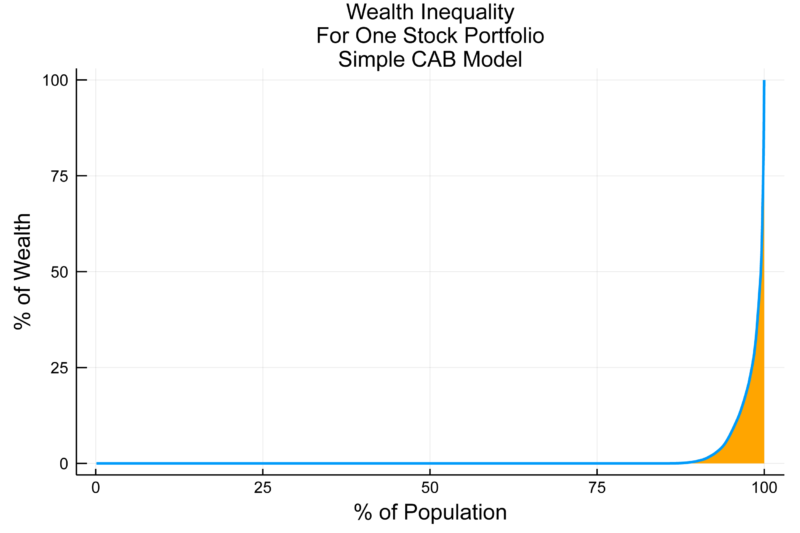
    In our simulation, we flip a coin for each stock every month. If heads, the stock in question gains 19.5%. If tails, it loses 18.5%. This gives us the desired 19% standard deviation, with monthly expected return of 0.5% (6% annualised) for each individual stock. [6] The chart below shows the ending wealth distribution after running this simulation for 100 years on 1000 families. Like the YSM, our model predicts a high level of wealth inequality. Unlike the YSM, our model features a growing economy.


    Chart showing: wealth inequality for one stock portfolio


    Interpreting model results

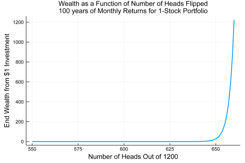
    All families have identical prospects starting out, yet high levels of wealth inequality naturally arise anyway. What’s at work here? First, with portfolios concentrated in just a few individual stocks, chance creates a lot of inequality in wealth outcomes. [7] Second, good luck, measured by the number of heads flipped, translates into increasingly large incremental gains in wealth. That means wealth as a function of luck is highly convex in the long-term, as good or bad luck compounds multiplicatively rather than additively. This can be seen in the dramatic curvature of wealth plotted against number of heads flipped over 100 years in the chart below.


    Chart showing: wealth as a function of number of heads flipped over 100 years of monthly returns for a 1-stock portfolio


    The third force leading to extreme inequality causes many families to wind up with near zero wealth despite investing in stocks that are all expected to rise 6% a year, as can be seen in the chart above. Over the 1,200 months of the 100-year simulation, the expected number of heads is 600, half of the total flips. Yet, the chart shows that if a household experienced 600 heads, they’d wind up with close to 0 wealth. In fact, they need to get 642 heads just to break even. [8] This results from “over-betting the edge,” defined as taking so much risk that you lose money in the central case of flipping an equal amount heads and tails. If a single stock portfolio gains 19.5% one month and then loses 18.5% the next month, the total return over the two months is not the +1% you’d get from two months of +0.5% expected return per month. Rather, it is -2.6% as illustrated in the diagram below. [9]


    In addition to being able to generate different levels of inequality to a given horizon, we can also influence the degree of wealth mobility in our system by choosing how quickly we allow families to diversify their portfolios by adding more stocks with increases in a household’s wealth. Through this mechanism, the winners get more diversification, lessening their over-betting and increasing the chance of keeping and growing their winnings.

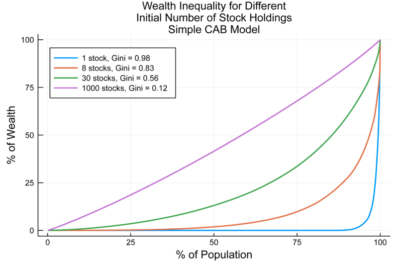
    An important parameter in the basic form of our model is the number of stocks initially held. The chart below shows how greater initial diversification, and thus less over-betting, dramatically lessens wealth inequality. For each distribution of wealth curve, we calculate the Gini coefficient, a popular summary metric of inequality. [10] Holding 100% of wealth in an 8-stock portfolio represents the acceptable amount of risk for a gambler who bases her risk-taking on the Kelly Criterion, a commonly-used metric which gamblers generally agree sets an upper bound on how much risk to take for a given opportunity. [11] Even though an investor with an 8-stock portfolio in our framework can no longer be accused of over-betting, she could still improve the quality of her portfolio dramatically with more diversification. If we had investors start off with portfolios of 1,000 stock holdings, we’d get very little wealth inequality, which is what we’d expect if most families held the market portfolio through an index fund.


    Chart showing: wealth inequality for different initial number of stock holdings


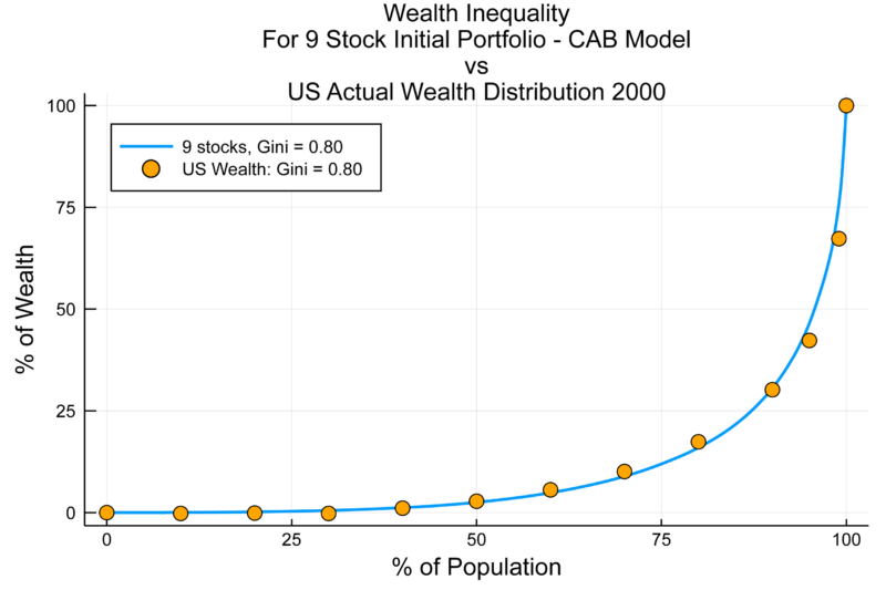
    The chart below displays the actual distribution of wealth in the US in 2000, [12] which is a good fit with our model using a 9-stock initial portfolio for each investor.


    Chart showing: wealth inequality for 9-stock initial portfolio


    Conclusions and future research

    While we recognize that there are many causes of wealth inequality, the CAB Model provides a simple and empirically-supported explanation for how the level of wealth inequality seen today came about. Some of the assumptions we’ve made may seem extreme by today’s standards, such as using a 19% monthly standard deviation of stock returns, but the CAB results are robust to more moderate assumptions. Indeed, if the US investing scene for most of the 20th century resembles developing markets today, then a recent paper by Campbell et al, “Do the Rich Get Richer in the Stock Market? Evidence from India (2018),”  provides direct support for the CAB explanation of wealth inequality resulting from pervasive under-diversification. [13]

    We hope this short note will spur further research focused on understanding the properties of this model of wealth inequality, and on refinements to make the model more realistic while still retaining its parsimonious structure. In particular, we hope to explore its ability to match observed levels of wealth mobility, the impact of a wealth-redistribution tax, and how to incorporate non-participation and underinvestment in risky assets as another important cause of long-term wealth inequality.

    The CAB model provides an alternative to that proposed by Thomas Piketty in “Capital in the 21st Century”  (2014), which assumes that equity returns are high and constant, so once a household gets rich enough to have significant investable wealth, they’re going to get richer and richer. [14] Unlike Piketty’s Capital model, CAB tells us where the “missing billionaires” may have gone, incorporates pervasive sub-optimal risk sizing, and predicts the frequently observed downward mobility of the undiversified wealthy. It also points the way to a more level potential distribution of wealth in the future, due to the growth over the past 20 years of index funds and other diversified mutual funds. [15]

    Unlike the Piketty and the Yard Sale models, the CAB paradigm does not see extreme wealth inequality as an inevitable and convergent feature of “pure” capitalism absent specific offsetting policies such as wealth redistribution. Rather, it shines a bright and hopeful light on one possible path to less wealth inequality in the future, which is for investors to think more carefully about diversification and investment-sizing, thus improving their chances of participating in the long-term expected wealth creation opportunities offered by public markets.


    Victor Haghani, Jeffrey Rosenbluth and James White work for Elm Partners.


    Related articles

    When active investing distorts markets

    The costliest bias of all

    Victor Haghani: sensible investing in a nutshell


    Image: Suad Kamardeen (via Unsplash)


    Footnotes

    [1] Schwab historical commissions

    [2] Clark et al, 2019:
    “In the early 1950s, 4.2% of the U.S. population participated in the stock market, almost entirely through directly held stocks (Federal Reserve Board, 2019). These investors held undiversified portfolios – a median of two stocks. Half held one stock…Stock investing resembled a game of portfolio roulette. In today’s terms, one spin of the wheel might come up Amazon. The next might be Enron. This approach predominated until the 1980s.”

    [3] We assume there are enough stocks so that each household owns different stocks.

    [4] We are in effect assuming that each household spends the dividends they receive on their stock portfolio.

    [5] It may appear that the assumption that the individual stocks are uncorrelated, and hence all have a Beta of 0, is unrealistic. Relaxing that assumption, for example by giving all stocks a Beta of 1, does not materially change our results.

    [6] As will become apparent below, even if we had chosen a single stock risk level half of the Bessembinder estimate, the model would produce a similar pattern of results.

    [7] The wealth inequality among families generated in our simple model is a direct reflection of the highly unequal long-term performance of individual common stocks, which is partly a result of the compounding effect we described above. Bessembinder (2017) observes that:
    “…approximately 26,000 stocks that have appeared in the CRSP database since 1926 are collectively responsible for lifetime shareholder wealth creation of nearly $32 trillion dollars. However, the eighty six top-performing stocks, less than one third of one percent of the total, collectively account for over half of the wealth creation. The 1,000 top performing stocks, less than four percent of the total, account for all of the wealth creation…The positive skewness arises both from the fact that monthly returns are positively skewed, and from the possibly underappreciated fact that compounding introduces positive skewness into the multi-period return distribution even if single period returns are distributed symmetrically…which contributes to the concentration of wealth creation.”

    [8] But if they get just 18 heads more than that, for a total of 660 heads, their wealth will have grown more than one-thousand-fold, catapulting them into the ranks of the super-rich. Unfortunately, there is only 0.03% probability of getting 660 or more heads.

    [9] By contrast, a one-stock portfolio with just 15% invested in the single stock would make money in the central case of flipping an equal number of heads and tails, i.e. (1+15% * 19.5%) (1-15% * 18.5%) – 1 = +0.07%. The Kelly Criterion calls for 14%, rather than the 15% in this example, and anything over 28% (i.e. twice the Kelly bet) would be over-betting as we’ve defined it here.

    [10] The Gini Coefficient on Wikipedia: https://en.wikipedia.org/wiki/Gini_coefficient

    [11] The Kelly Criterion on Wikipedia: https://en.wikipedia.org/wiki/Kelly_criterion

    [12] Davies, James, Susanna Sandström, Anthony B. Shorrocks and Edward N. Wolff. “The Level and Distribution of Global Household Wealth.”  NBER Working Paper No. 15508. 2009.

    [13] The authors conclude:
    “Return heterogeneity increases the inequality of account size through two main channels, both of which are related to the prevalence of undiversified accounts that own relatively few stocks. The first is that some undiversified portfolios randomly do well, while others do poorly. The second is that larger accounts tend to earn higher average log returns. They do so not by earning higher average simple returns, but by limiting uncompensated idiosyncratic risk which lowers the average log return for any given average simple return.”  (p15).

    [14] See this paper for a set of essays evaluating the Piketty model:
    “The Central Contradiction of Capitalism? A collection of essays on Capital in the Twenty-First Century,”  Edited by Geoffrey Wood and Steve Hughes (2015).

    [15] See Calvet et al (2007) for how Swedish households at the turn of the 21st century were making better investment decisions, but still with room for material improvement, than Americans were for most of the 20th century.


  4. When active investing distorts markets

    Comments Off on When active investing distorts markets


    By VICTOR HAGHANI and JAMES WHITE


    Home bias refers to the tendency to invest more heavily in one’s domestic equity market than global market-value proportions would suggest. When Warren Buffett advises his heirs to put 90% of their inheritance in the S&P 500 and the rest in US Treasuries, that’s an (extreme) example of the kind of home bias we’re talking about. At the other end of the spectrum, an investor from Switzerland investing even 10% of her wealth in Swiss stocks would be showing a high degree of home bias as well. Distorts markets.

    Whether or not home-biased investing makes sense, the fact is that people in pretty much every country do it. Our question is: if everyone’s doing it, does it matter? Or if everyone equally over-weights their domestic market does it all pretty much wash out, with the over-weights cancelling out the under-weights?

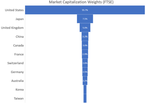
    Let’s address the question with a stylised thought experiment, based loosely on home bias surveys. Such studies indicate that US investors invest 80% — 85% in the US market. In smaller markets, such as the UK and Canada, investors allocate about 50% of their equity investments domestically, an even larger divergence from market capitalisation weights, as can be seen by comparison with the chart below.[1]


    distorts markets


    We start by assuming a world with no home bias, and eleven national markets with a total value of $100: a big market weighing in at 50% of the total, and ten small markets representing 5% each.[2] We’ll also assume that investor wealth lines up with the size of their respective markets.

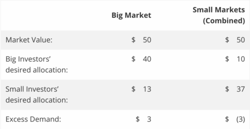
    Now we’re going to flip a switch and turn home bias on: big market investors now want to be 80% invested in their domestic market, 30% above market cap weight. The ten small markets exhibit even stronger home bias, wanting to be 50% invested in their home market, 45% above their 5% weight. The table below shows how the numbers play out (see calculations here):


    distorts markets


    The Big market investors want to put $40 into their home market, leaving $1 to invest in each of the ten Small markets. The small market investors want to put $2.50 into each of their home markets, and allocate their other $2.50 of investments according to market cap weights – so $1.32 (50/95) into the Big market for a total of $13, and the rest, $1.18, split equally among the other nine Small markets.

    By flipping the home bias switch we’ve created a supply-and-demand problem: the big market isn’t currently big enough to take the $40 from domestic investors plus the $13 from the small market investors, as this adds up to $53 and the market-value is only $50. The small markets in aggregate will have a corresponding shortfall in demand.[3] We can see that if big market investors want to own 80% of the $50 of their market, then all that’s left for the small market investors combined is $10 of the big market, so at most they can have a 20% allocation to the big market. Any greater desired allocation creates excess demand for the Big market.

    Ultimately, this conundrum must be resolved by market values changing: specifically the big market going up in value relative to the small markets. All else equal it would have to go up quite a lot: 60%, from $50 to $80 if we hold the small markets constant.[4] The increase in Big market value could be accomplished either through rising prices or through new issuance. If prices rise, this would mean a reduction in the long-term expected return of the big relative to the small market of around 1.5% pa, a very sizeable impact assuming both markets had expected returns around 4% without the home bias distortion. If instead there’s new issuance, such issuance would represent less attractive investment opportunities at the margin than previously outstanding equity, resulting again in lower expected returns for big market equities.[5]


    Conclusion

    We read so much about how indexing is causing distortions in markets, but we’ve seen here how not indexing can itself lead to significant distortions. If there were less home bias and more passive investing in line with global market-value proportions, US equity investors would likely enjoy lower relative valuations and higher expected returns. While we agree with Mr. Buffett’s advice to non-professional investors that indexing is the way to go, we wish he’d have encouraged his disciples to take a more worldly perspective.


    VICTOR HAGHANI is the founder and CIO of Elm Partners. JAMES WHITE is the company’s CEO. Victor is based in London and James in Philadelphia.


    Related articles:

    Victor Haghani – Sensible investing in a nutshell

    The costliest bias of all


    References:

    [1] Figures vary across studies, and most are based on data which is 15-20 years old. For example, see these articles: Home Bias in Global Bond and Equity Markets (2006 working paper)Forbes 2018 and this from Vanguard: The Role of Home Bias in Global Asset Allocation Decisions (2012). Also, even the fraction of global market cap represented by the US is debated, with some analysts suggesting that 30%, the raw weight excluding free-float and investability adjustments made by FTSE and MSCI, is the more appropriate weight to use.

    [2] Equivalently, we could have started out with a world with 100% home bias, in which investors allocate 100% of their equity investments to their domestic equity markets. Relaxing the assumption that wealth is proportional to domestic market value will increase (decrease) the imbalance caused by Home Bias if wealth in the Big market is greater (less) than it would be under the proportional assumption.

    [3] More generally, with one Big market making up 50% of the total market, and many small ones comprising the other 50%, the Home Bias deviation from market weight in the Small markets needs to be two times the deviation in the Big market to balance out. Any Small market Home Bias less than that results in excess demand for the Big market (and vice versa). The formula for the balancing amount of Small market Home Bias as a function of Big market Home Bias and the Market Weights of the Big and Small markets is:

    HBSmall = 1 – (1 – HBBig)(1-MWSmall)/MWBig

    where HB is Home Bias, and MW is Market Weight.

    [4] We make the simplifying-but-imprecise assumption that domestic wealth moves in line with the value of the home market. Also, there are an infinite set of moves of Big and Small markets that would accomplish the balancing, such as Big up 20% and Small down 25%.

    [5] Another flavour of this resolution is for equity long-short funds to short the Big market and go long the Small markets, but again, this presumably would require an inducement in terms of a positive expected return spread between the Big and Small equity markets.


    Picture: Markus Spiske via Unsplash