By PAUL D. KAPLAN from Morningstar
The circumstances of the current market crash might be unique to the coronavirus pandemic, but they lead investors to wonder: Are such drops normal for equity markets, or is this different?
During the global financial crisis of 2007–09, some observers described the events that unfolded as a “black swan”, meaning a unique negative event that couldn’t be foreseen because nothing similar had happened before. But the data I’d seen from Ibbotson Associates, a firm that specialised in collecting historical market returns, demonstrated a long history of market crashes. Some ended up being part of a larger financial crisis.
Black swans or black turkeys?
How frequent are market crashes?
The overall number of market crashes depends on how far back we go in history and how we identify them.

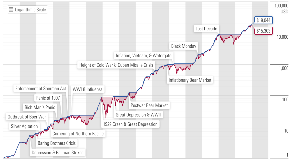
The chart shows that over this period of almost 150 years, $1 (in 1870 U.S. dollars) invested in a hypothetical U.S. stock market index in 1871 would have grown to $15,303 by the end of March 2020.
But it wasn’t a smooth ride to get there. There were many drops along the way, some of which were severe.
The market always rebounded
The market always eventually rebounded and went on to new highs, but it may have been hard to believe this during some of the long-term bear markets, including:
- The 79% loss due to the crash of 1929, which led to the Great Depression, the worst drop on the chart.
- The 54% drop from August 2000 to February 2009, also known as the Lost Decade. The second-worst drop on the chart, this period started when the dot-com bubble burst. The market began recovering but not enough to get the cumulative value back to its August 2000 level before the crash of 2007-09. It didn’t reach that level until May 2013 — almost 12 and a half years after the initial crash.
- The 51% drop between June 1911 and December 1920. This market downturn, the fourth-worst on the chart, may be most relevant to today’s situation, since it included the influenza pandemic of 1918.
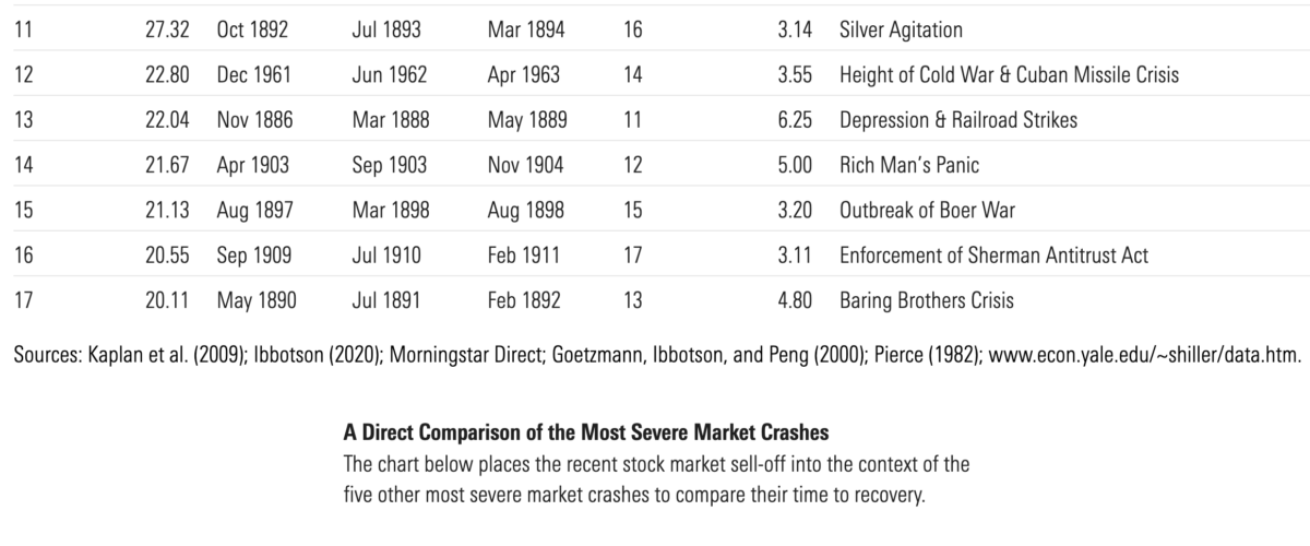
These examples show that market crashes have occurred numerous times throughout the 19th, 20th, and 21st centuries (even before the coronavirus crash). Recognising their frequency can help provide a better sense of the risks of equity investing.
Measuring the pain of market crashes
To measure the severity of each market crash in a way that takes into account both the degree of the decline and how long it took to get back to the prior level of cumulative value, I calculated a “pain index” for each one.
The pain index for a given episode is the ratio of the area between the cumulative value line and the peak-to-recovery line, compared with that area for the worst market decline of the past 150 years. So, the crash of 1929/ first part of the Great Depression has a pain index of 100%, and the other market crashes’ percentages represent how closely they matched that level of severity.
The Great Depression versus the Cuban Missile Crisis
For example, the market suffered a 22.8% drop during the Cuban Missile Crisis. The crash of 1929 led to a 79% drop, which is 3.5 times greater. That’s significant, but the market also took four and a half years to recover after that trough, while it took less than a year to recover after the trough of the Cuban Missile Crisis. So, the pain index, considering this time frame, shows that the first part of the Great Depression was actually 28.2 times worse than the Cuban Missile Crisis downturn.
The chart below lists the bear markets for the past nearly 150 years, sorted by the severity of market decline. It also shows the pain index and pain index ranks.
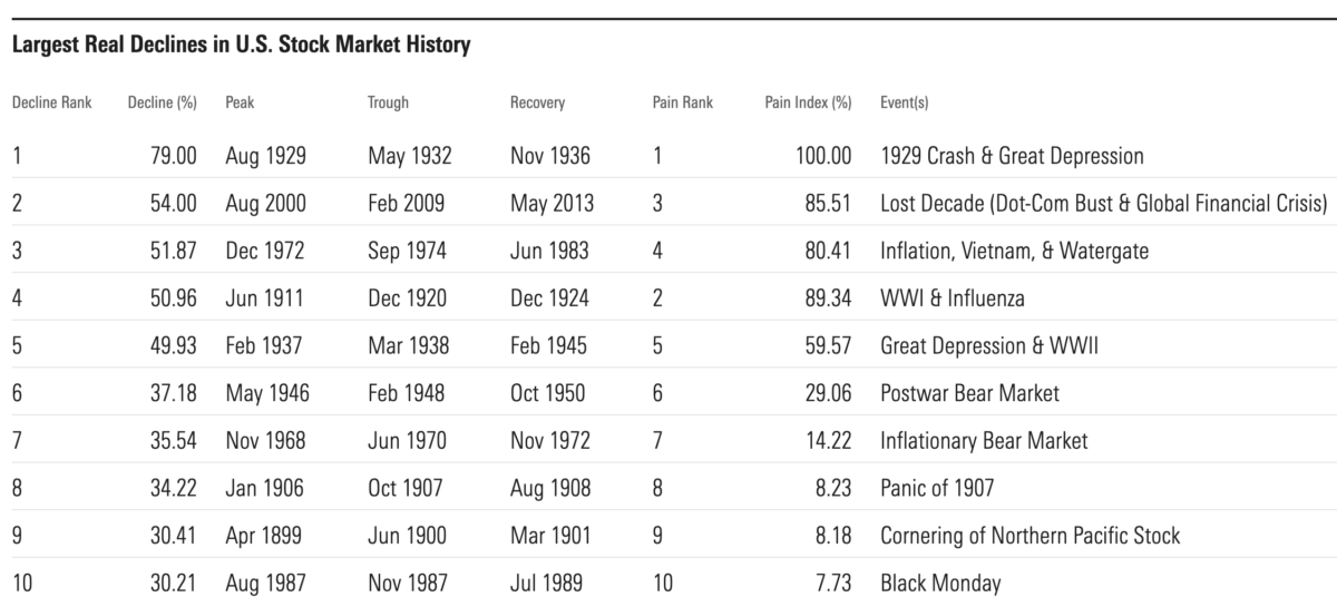
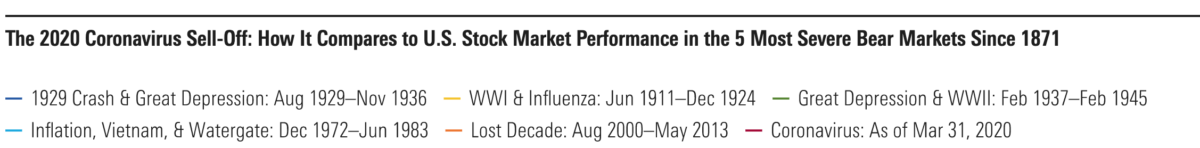
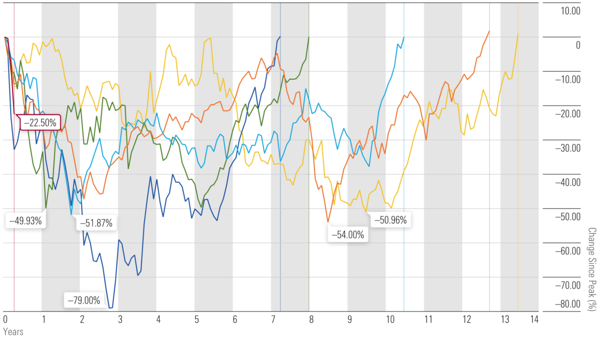

The Great Depression versus the coronavirus crisis
In terms of steepness, the current decline is serious — it roughly matches the initial sell-off during the crash of 1929. The other most severe episodes include the inflationary bear market during Vietnam/ Watergate, the second half of the Great Depression/ World War II, the Lost Decade, and the World War I/ influenza pandemic downturn that I previously mentioned.
Naturally, there’s a lot of variation in the length and severity of each episode. These five market crashes had an average of 57 months between when the decline began and when the market hit its trough. On average there were 125 months between when the decline began and when the market reached its previous peak. In addition to these episodes, there were also 12 other bear markets over the 150-year period. Overall, bear markets have occurred roughly every nine years.
A worldwide pattern
It’s impossible to know how long this particular decline will last and how long the recovery will take. Nevertheless these averages make it easier to understand how many times the sky also seemed to be falling over the past nearly 150 years, and that the market always recovered its value, and then some.
When risks become rewards for patient investors
This historical stock market return data provides clear evidence that market crashes aren’t as unique as one might have thought. The term “black turkey” is more apt, since they appear every so often — and today’s coronavirus-caused crash is only the most recent example.
Given what this data shows about the regularity of market declines, it’s clear that market risk is about more than volatility. Market risk also includes the possibility of depressed markets and extreme events.
These events can be frightening in the short term, but this analysis shows that for investors who can stay in the market for the long run, equity markets still continue to provide rewards for taking these risks.
PAUL D. KAPLAN is director of research with Morningstar Canada. He is a member of the editorial board of Morningstar magazine.
Here are some other articles about the impact of the coronavirus crisis on the markets that we’ve published here on TEBI in recent weeks:
How did UK active managers fare in the market rout?
How worried should investors be about a recession?
The economy and the stock market are not the same
Are markets still rational, even in a crash?
Will the optimists triumph again?
Remember, you’ve trained for this
Stay the Course: our crisis survival kit for advisers
How did different risk factors perform in Q1?
Sparrows Capital: How we limited losses when markets plummeted
Picture: Jamie Street via Unsplash