
Why expected returns matter more than index concentration
- Robin Powell

- Feb 27
- 9 min read
Everyone's been arguing about whether the S&P 500 is too top-heavy. But index concentration is a distraction. The real threat to your long-term wealth is compressed expected returns, and responding to them demands a very different prescription from the one the fund industry is selling.
Say you go for a routine check-up and the scan throws up something alarming. Your doctor pulls up a chart, points to the spike, and recommends aggressive treatment: expensive drugs, regular monitoring, maybe surgery. Then you get a second opinion. A specialist looks at the same scan and shrugs. That spike? It's been showing up in healthy patients for decades. It's a normal feature of how the body works, not a disease. The real threat to your health is something quieter (your blood pressure, say) that nobody thought to mention.
This is roughly what's happened in the investment world over the past two years.
The Magnificent Seven — Apple, Microsoft, Nvidia, Amazon, Alphabet, Meta, and Tesla — now account for more than 30% of the S&P 500's total market value. That concentration looks dramatic on a chart, and the fund industry has treated it as a diagnosis. The prescription? Active management to "reduce concentration risk." Tactical allocation strategies. Alternative investments. Equal-weighted index funds. All, conveniently, more expensive than the plain index tracker an investor already owns.
It's a compelling sales pitch. Nobody wants to hear that their portfolio has a dangerous imbalance. And nobody asks awkward questions when the proposed cure sounds sophisticated.
But recent academic research suggests the diagnosis is wrong. The symptom is real — concentration is measurable and visible — but it's being mistaken for a disease. The expensive treatments being prescribed may be doing more harm than the condition they claim to fix.
Concentration looks dramatic but isn't dangerous
Here's the second opinion.
In Magnificent, but Not Extraordinary, Bye, Kvaerner, and Werker (2026) reconstruct the history of US market concentration back to 1925. The picture is reassuring. In May 1932, AT&T, Standard Oil, Consolidated Gas, and four other firms held roughly one-third of total US stock market value. The Magnificent Seven's current share is comparable. What feels unprecedented is, by historical standards, ordinary.
Bye et al. go further. They show that concentration doesn't require bubbles, manias, or market dysfunction to emerge. Idiosyncratic volatility — the normal, firm-specific variation in stock returns — naturally produces outsized clusters of firm size. Some companies grow faster than others for a while, and in a large market that's enough to generate the kind of concentration that makes headlines. The mechanism is statistical, not pathological.

So if concentration isn't a warning sign, what happens when you trade on it as though it were? Kritzman and Turkington answer this in The Fallacy of Concentration (2025). They built a trading rule that reduced equity exposure when concentration was high and increased it when concentration was low — the strategy the fund industry is implicitly recommending. Its risk-adjusted performance (Sharpe ratio) came in at 0.39, versus 0.52 for staying invested. Lower returns and worse risk-adjusted outcomes. As they put it, the buy-and-hold approach "generated more than twice as much wealth" as the dynamic strategy.
The scan looked worrying. The specialist says the patient is fine.
The quiet risk that threatens your wealth
In a new analysis, Elm Wealth argues that investors are fixating on the wrong signal. The real concern isn't how concentrated the index is — it's what the index is priced to return. And on that measure, the numbers have compressed to levels most investors haven't absorbed yet.
Elm Wealth estimates that the long-term expected return of US equities is only about 1% above the expected return on US inflation-protected bonds (TIPS). That figure is roughly in line with the consensus of a dozen major investment houses.
To grasp what that means, consider a simple comparison. An investor putting £100,000 into US equities 30 years ago could reasonably have expected an excess return over safe assets of around 5% a year. Over three decades, that compounds to roughly £432,000. At 1% excess return — today's consensus — the same £100,000 grows to around £135,000. That's not a rounding error. It's the difference between a comfortable retirement and a compromised one.
This is the blood pressure reading. It won't make headlines or fill conference agendas. But it's the number that will quietly shape the financial outcomes of every long-term investor holding US equities — far more than whether seven stocks or seven hundred sit at the top of the index.
What happens when you listen to expected returns
If concentration isn't the signal, what is?
Elm Wealth's answer, drawn from Victor Haghani and James White's book The Missing Billionaires (2023), is expected returns themselves. The principle is straightforward: when valuations are low and expected excess returns are high, increase your equity exposure. When valuations are stretched and expected excess returns are compressed — as they are now — reduce it. You're not calling tops and bottoms. You're responding to slow-moving, publicly observable information about what equities are priced to deliver.
The results bear this out. Haghani and White tested a dynamic approach against a static 60/40 allocation using US equity data from 1900 to 2022. The dynamic strategy — adjusting equity exposure based on the excess earnings yield relative to TIPS — produced an end value of $376,956. The static approach produced $22,158. Over 122 years, the valuation-aware investor built roughly 17 times the wealth of the set-and-forget investor.
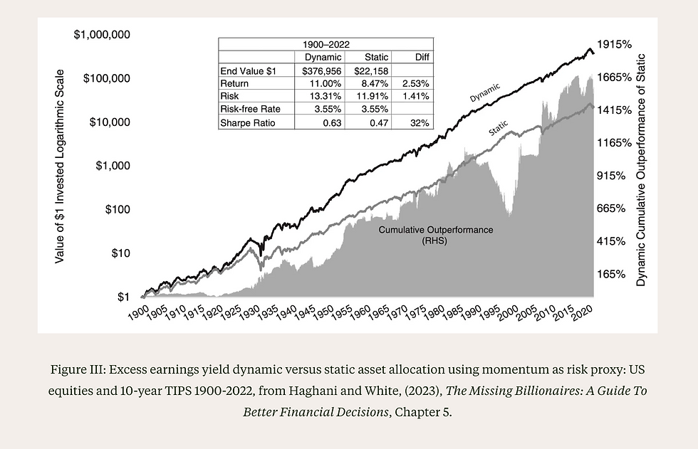
The annualised returns were 11.00% versus 8.47% — a gap of 2.53 percentage points a year. The risk-adjusted picture was just as clear: a Sharpe ratio of 0.63 versus 0.47. Better returns and less risk per unit of return.
What makes this pointed is where the useful information sits. In their earlier 2021 research, Elm Wealth showed that the largest stock needs only about 0.08% more expected return than the 100th largest for capitalisation weights to be optimal. A trivially small hurdle. The signal isn't in how concentrated the index is. It's in what the index is priced to return.
There's a natural objection: isn't this market timing dressed up in academic language? No. Market timing tries to predict short-term moves based on momentum, sentiment, or gut instinct. Valuation-aware allocation responds to the long-term expected return embedded in current prices — a number that moves slowly, is widely estimated, and has a century of evidence behind it.
Why "expensive" might be the new normal
If valuation-aware investing works, an obvious question follows: are US equities genuinely overpriced, or has something changed in the underlying economy?
Research from the Federal Reserve Bank of Minneapolis suggests the answer is both — and neither in the way most people assume. In A Macroeconomic Perspective on Stock Market Valuation Ratios (2026), Atkeson, Heathcote, and Perri decompose seven decades of US corporate valuation data and find something unexpected. The earnings yield — the traditional measure investors use to gauge whether stocks are cheap or dear — fell from roughly 9.5% in 1980 to about 4.6% in 2022. On its face, that looks troubling. But the free cash flow yield — the measure more directly tied to what investors receive — was stable at approximately 3.6% across both dates.

Why the gap? Two shifts in the US economy. First, the labour share of corporate output has declined, meaning a larger slice of what companies produce now flows to shareholders rather than workers. Second, measured corporate investment has weakened — firms need less physical capital than they once did. Together, these shifts mean companies generate more free cash flow relative to their reported earnings. Over two-thirds of the earnings yield decline is explained by measured capital becoming a smaller share of enterprise value.
The framing that captures this best is "justified but unrewarding." These valuations aren't a bubble waiting to burst. They reflect real changes in how the corporate sector operates. But justified prices still imply compressed returns. A P/E ratio that's elevated for good reasons still means you're paying more for each pound of future earnings.
There's a more recent wrinkle, too. By Q3 2025, even the free cash flow yield had dropped to roughly 2.4% — still within one standard deviation of its long-run average, but meaningfully below the 3.6% that had been stable for decades. The measure that had been reassuringly steady is now, itself, under pressure.
A P/E ratio that's elevated for good reasons still means you're paying more for each pound of future earnings.
What a low-return world means for your portfolio
None of this means selling your equities and hiding in cash. That's market timing, and the evidence against it is overwhelming. What it means is adjusting to fundamentals — and when expected excess returns are compressed, three things change.
Costs become make-or-break. When the expected equity premium over safe assets was 5%, a fund charging 1% in fees took a fifth of your excess return. Irritating, but survivable. When the premium is closer to 1%, that same fee consumes the entire margin. You're taking equity risk for a bond return. Even a charge of 0.50% devours half the expected premium. In a low-return world, fee arithmetic stops being a nice-to-know and becomes the most important variable within your control.
Global diversification earns its keep. US equities may be fully priced for the reasons the Fed research describes. Non-US markets — developed and emerging — don't share the same valuation profile. That's not a prediction that international stocks will outperform. It's simpler than that: when one market's expected returns are compressed, concentrating your portfolio entirely in that market is a bigger bet than it used to be. Spreading across geographies isn't a hedge against disaster. It's an acknowledgement that you don't know where future returns will come from.
Planning assumptions need honesty. Retirement projections built on historical average returns — the kind that assume 7% or 8% nominal growth stretching decades into the future — may overstate what today's starting valuations can deliver. Better to plan on more conservative figures and be pleasantly surprised than to discover the shortfall at 68. This isn't pessimism. It's the stress-testing that evidence-based investors should welcome.
The treatment that works here is unglamorous. Lower your costs. Broaden your diversification. Build your financial plan on honest numbers rather than flattering ones. No expensive prescriptions. No dramatic interventions. The quiet, compounding advantage of getting the basics right when the basics matter more than ever.
The diagnosis that matters
"Getting rich slowly has never been a glamorous pitch. But it remains the only one with the evidence behind it."
The scan was a distraction. Index concentration made for eye-catching charts and urgent sales pitches, but nearly a century of data says it's a normal feature of healthy markets. The fund industry diagnosed a condition that didn't exist and prescribed costly treatments that made things worse.
The underlying condition — compressed expected returns — is what threatens long-term wealth. And unlike concentration, the evidence for how to respond is clear. Valuations contain real information. Costs compound ruthlessly when margins are thin. Diversification matters more, not less, when one market is priced to deliver less.
None of this calls for panic. Knowing that expected returns are lower than they've historically been isn't a reason for despair — it's a foundation. Investors who plan honestly, control their costs, and stay disciplined through the quiet stretches have always done well. They just do it slowly. Getting rich slowly has never been a glamorous pitch. But it remains the only one with the evidence behind it.
Resources
Atkeson, A., Heathcote, J., & Perri, F. (2026). A macroeconomic perspective on stock market valuation ratios. Federal Reserve Bank of Minneapolis Staff Report 682.
Bye, P., Kvaerner, J., & Werker, B. (2026). Magnificent, but not extraordinary: market concentration in the US and beyond. Working paper, Tilburg University and BI Norwegian Business School.
Haghani, V., & White, J. (2023). The Missing Billionaires: A guide to better financial decisions. Wiley.
Haghani, V., & White, J. (2021). Are market capitalization weighted indexes too concentrated in the biggest stocks? SSRN.
Kritzman, M., & Turkington, D. (2025). The fallacy of concentration. Working paper, Windham Capital Management and State Street Associates.
Recently on TEBI
You understand the evidence. Now find an adviser who believes it too
Our Find an adviser directory lists professionals committed to low-cost, globally diversified portfolios and straight answers. Connect with someone who'll respect your knowledge instead of trying to sell you expensive active funds. Search your area now.
For advisers: Connect with Robin on LinkedIn


