The Evidence-Based Investor

Tag Archive: Indexology

  1. A diverse portfolio is a strong portfolio

    Comments Off on A diverse portfolio is a strong portfolio


    By CRAIG LAZZARA


    We can think of an active equity portfolio as a combination of a benchmark (the S&P 500®, for example) and a set of active bets that measure the portfolio’s deviation from the benchmark. The relative size of the active bets is sometimes called “active share,” and is a convenient way to judge a manager’s aggressiveness. An active share of 0% is associated with an index fund; an active share of 100% implies that the manager has no holdings in common with his benchmark. (It may also imply that we’re using the wrong benchmark for the manager in question, but that’s another story.)

    It’s been suggested that high active share is associated with outperformance, although the evidence on the question is far from conclusive. Although high active share may (or may not) be a necessary condition for active success, it cannot be a sufficient condition. Can an underperforming manager improve his results by randomly selling half the names in his portfolio, thus creating more concentration? Doing so will increase active share for sure, but it stretches credulity to think that such a course would automatically improve performance.

    In our view, the stronger argument runs the other wayother things equal, more names are better than fewer. This is because stock market returns tend to be positively skewed. Rather than being symmetrically distributed around an average, return distributions typically have a very long right tail; a relatively small number of excellent performers has a disproportionate influence on the market’s overall return.


    Table showing underperformance


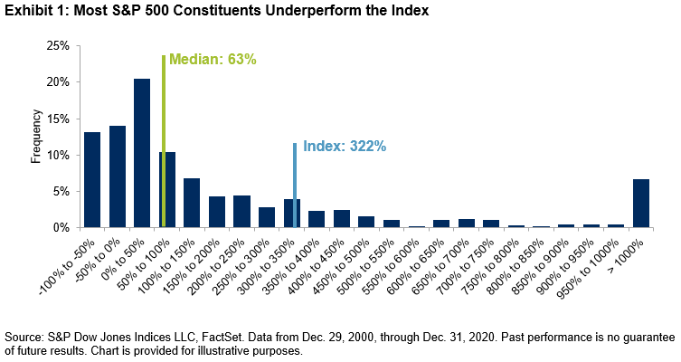
    Exhibit 1 illustrates the skewness of the S&P 500 over the last 20 years. The median stock in the index returned 63%, while the index’s return was 322%. Only 22% of the names outperformed the index, which helps explain why active results have been so disappointing. When a randomly chosen stock has roughly one chance in five of beating an index fund, successful stock selection is very difficult. A portfolio manager who opts to concentrate his holdings will need a level of predictive accuracy that most portfolio managers demonstrably do not have.

    Instead, the implication of Exhibit 1 is that more diversified portfolios, by including more stocks, stand a better chance of outperformance. Skewed returns mean that an active portfolio’s success depends on whether it is overweight a relatively small number of names. The more names a portfolio holds, the more likely it is to own one of the relatively small number of big winners.

    Otherwise said: rather than picking the 50 stocks she likes the best and holding them, an investor benchmarked against the S&P 500 might be better served by eliminating the 50 stocks she likes the least and holding the other 450. True, active share would be lower for the larger portfolio. But the likelihood of owning one of the relatively rare big winners would be nine times as high. When returns are skewed, increasing diversity increases the odds of success.


    CRAIG LAZZARA is Managing Director and Global Head of Index Investment Strategy at S&P Dow Jones Indices. This article was first published on the Indexology blog.


    MORE FROM S&PDJI

    For more valuable insights from our friends at S&P Dow Jones Indices, you might like to read these other recent articles:

    Why even Buffett has been buffeted by the index

    The case for looking beyond the S&P 500

    The impact of style bias on the latest SPIVA data

    Three reasons for active managers to feel positive

    What does GameStop mean for market efficiency?

    Is equal weighting worth considering?


    WHAT TO READ NEXT

    If you found this article interesting, we think you’ll enjoy these too:

    The only right way to view an asset

    The risks in buying individual stocks

    Can machines identify winning fund managers in advance?

    Can active managers time factor exposures?

    The odds of outperforming through active management

    Which is best for corporate bonds — active or passive?


    FIND AN ADVISER

    The evidence is clear that you are far more likely to achieve your financial goals if you use an adviser and have a financial plan.

    That’s why we’re now offering a service called Find an Adviser.

    Wherever they are in the world, we will put TEBI readers in contact with an adviser in their area (or at least in their country) whom we know personally, who shares our evidence-based investment philosophy and who we feel is best able to help them. If we don’t know of anyone suitable we will say.

    We’re charging advisers a small fee for each successful referral, which will help to fund future content.

    Need help? Click here.


    © The Evidence-Based Investor MMXXI


  2. Are there any excuses left?

    Comments Off on Are there any excuses left?


    By ALBERTO ALLEGRUCCI


    For the first time, the SPIVA Europe Mid-Year 2020 Scorecard introduced risk-adjusted performance evaluations of European equity funds. Previously, proponents of active fund management may have criticised the SPIVA scorecard for measuring performance on a return-only basis. They may have argued that this only told one side of the story, and that their abilities should also have been judged on the level of risk that they employed. After all, given funds with similar returns, would investors not prefer the fund with lower risk?

    A similar question could arise when comparing active funds with their benchmarks. Do benchmarks perform better simply because they take on more risk? Adjusting returns by the risk involved allows us to tell the whole story and more closely compare how well active funds and their benchmarks performed per unit of risk taken.


    Do European benchmarks still perform well on a risk-adjusted basis?

    In our latest SPIVA Europe Scorecard, a fund or benchmark’s risk-adjusted return was computed as the annualised average monthly return divided by annualized standard deviation of the monthly return for the period observed. The intuition is straightforward: rather than looking at absolute returns, we looked at the returns attained per unit of risk borne by the investor.

    Exhibit 1 shows the percentage of European equity funds outperformed by their benchmark and compares the metrics computed using different measures of performance. The percentage of funds that outperformed the benchmark was largely unaffected by adjusting the performance by its risk, and the notion that active funds may yield lower returns because they were less risky did not seem to be confirmed by the data. Otherwise, once adjusted for risk, we should have seen a much lower percentage of active funds being outperformed by their benchmark across the different time periods. Instead, we saw similar numbers, which increased steadily when looking at the medium to long term.

    This highlights a stylised fact already well substantiated by our SPIVA scorecards: in the long run, the majority of active funds failed to beat the benchmark.


    The case of the UK

    Exhibit 2 shows the results of carrying out the same exercise for U.K.-focused equity funds. In the short term, active funds performed better on a risk-adjusted basis: only 12% were outperformed by the benchmark on a risk-adjusted basis, compared with 32% when looking at absolute returns.

    However, when looking at longer periods, the same pattern as was seen in Europe emerged. Not only did it seem harder for active funds to beat their benchmark in absolute performance terms, but their risk-adjusted performance could not keep up either. Across the 10-year period, the relationship seen in the short term was inverted; on a risk-adjusted basis, a larger percentage of active funds were outperformed by the benchmark compared to an absolute return basis.


    Our SPIVA Europe Mid-Year 2020 Scorecard also shows risk-adjusted performance metrics for other European fund categories. In most cases, the conclusion was similar: risk adjustment did not seem to save active funds from being outperformed by their benchmarks.

    With this new addition to the SPIVA Europe Scorecard, it begs the question, “Are there any more excuses left for active managers?”


    This article was first published on Indexology, the S&P Dow Jones Indices blog. All of the articles on Indexology constitute opinions, not advice. 
    For more valuable insights from our friends at S&P Dow Jones Indices, you might like to read these other recent articles:

    A wasted opportunity for Australia’s fund managers

    Active or passive — which is more volatile?

    How long do top-quartile funds stay there?

    Three hundred and twenty billion dollars

    US fund managers flopped in the crisis

    92% of Canadian fund managers underperformed in 2019

    Does adjusting for risk make active performance any better?


    PREVIOUSLY ON TEBI

    Here are some other recent posts you may have missed:

    What exactly is an index?

    Cost is a huge factor for non-profit endowments

    The new future shock

    Strong opinions loosely held

    A real long-term investment strategy

    When a bargain isn’t a bargain

    Changing investing requires laser focus

    Great companies often make poor investments


    CONTENT FOR ADVICE FIRMS

    Through our partners at Regis Media, TEBI provides a wide range of content for financial advice and planning firms. The material is designed to help educate clients and to engage with prospects.  

    As well as exclusive content, we also offer pre-produced videos, eGuides and articles which explain how investing works and the valuable role that a good financial adviser can play.

    If you would like to find out more, why not visit the Regis Media website and YouTube channel? If you have any specific enquiries, email Sam Willet, who will be happy to help you.


    Picture: Louis Hansel via Unsplash


  3. Do recent correlation levels tell us anything?

    Comments Off on Do recent correlation levels tell us anything?


    With stock markets falling or rising by 5 or even 10% a day just lately, it’s practically impossible to predict the direction of markets in the very short term. In the long term, as TEBI readers know, the picture is usually positive. But what about the short-to-medium-term? Some commentators claim that dispersion and correlation levels may at least provide a clue.

    Dispersion and correlation are sometimes regarded, mistakenly, as the same thing. But they’re subtly different. DISPERSION is the difference between the best and worst performers in an index of securities. CORRELATION is a measure of how much any two securities move in the same direction.

    CRAIG LAZZARA is Managing Director and Global Head of Index Investment Strategy at S&P Dow Jones Indices. He has been studying dispersion and correlation levels in the S&P 500. In his latest guest post, Craig explains why he believes current correlation levels are particularly worthy of attention.


    Mea culpa: Roughly a month ago I used a dispersion-correlation map to describe how index dynamics can illuminate market movements.  In particular, I reported that since high dispersion seems to be a necessary condition for a bear market, and S&P 500 dispersion levels at the end of February were far below those prevailing in past declines, conditions at that time did not look like bear markets had historically looked. 

    Since our analysis uses a 21 trading day look-back, I providentially noted that “in 21 more days we’ll have a completely new set of observations”. 21 days have now passed, and we have a completely new set of observations. 

    Market dynamics have evolved with extraordinary speed, as any sentient observer knows. Exhibit 1 shows the decline in the S&P 500 since its February 19th high, plotted against comparable data from the 2007-09 financial crisis. The index declined 32% from its peak through to the close of trading on March 20, 2020. The comparable loss of value during the financial crisis required a full year.


    Just as values deteriorated rapidly, dispersion and correlation shifted rapidly. Exhibit 2 plots 21-day trailing dispersion and correlation between February 19 and March 20. The movement toward higher dispersion and higher correlation — upward and to the right — is striking. Bear markets seem less dependent on correlation than on dispersion, and dispersion has increased dramatically. But what’s particularly striking is today’s elevated level of correlation.


    This makes fundamental economic sense, of course, since correlation measures the degree to which the components of the index move together. A pandemic of still-unknown duration and severity can be expected to affect every business adversely. The degree of adversity will obviously vary across industries, with some (e.g. airlines and hotels) suffering more than others (which accounts for heightened dispersion). But almost all will move down, driving correlations higher.

    Exhibit 3 makes it clear that this has happened to an unprecedented degree, as correlations within the S&P 500 reached record levels for the month ended March 20. Students of index dynamics will not be surprised: high volatility can be expected when both dispersion and correlation are elevated. It is hard, in fact, to find other months comparable to this one; Exhibit 3 highlights those closest to today in the upper right corner.


    Exhibit 4 identifies each month in which dispersion was above average and correlation was elevated (above 0.45), and asks what happened in the aftermath of the market’s reaching those levels. There have been 11 such months since 1971; in every case the market was higher a year later, with an average gain of 24%.


    Past results legendarily do not predict future returns, and today’s correlation levels suggest that more spikes in volatility might lie ahead. But selling stocks in environments like the present has historically meant missing out on the recovery.


    This article was first published on the Indexology blog and is republished here with permission.


    Also by Craig Lazzara:

    Does passive investing encourage companies to collude?

    A new way of looking at indexing

    Are passive managers really kings of Wall Street?

    Fund performance jiggery pokery


    Picture: Ussama Azam via Unsplash


  4. Which performs better, the S&P 500 or the S&P 500 ESG Index?

    Comments Off on Which performs better, the S&P 500 or the S&P 500 ESG Index?


    By BEN LEALE-GREEN


    Does the S&P 500® receive a premium over the S&P 500 ESG Index? Absent a premium from the S&P 500, investors could have their cake and eat it too with the S&P 500 ESG Index: similar or better performance, along with the benefits of ESG.

    Academic literature suggests no sin stock premium over their non-sin counterparts. Sin stocks are usually defined by their product involvement (e.g., tobacco, controversial weapons, etc.). “The Price of Sin”[1] explored apparent outperformance of sin stocks, citing theories of neglected stocks and segmented markets. When adding sector controls to factors while ensuring the sin stock indices assessed are market-cap weighted[2] and evolving asset pricing models to include quality and low volatility factors,[3] a lack of sin premia was observed.

    While the S&P 500 ESG Index does exclude some sin stocks, it also takes a more holistic view of ESG and removes the worst ESG companies, as measured by the S&P DJI ESG Scores.[4] Exhibit 1 displays the selection process for the S&P ESG Index Series.


    S&P 500 ESG Index constituent selection


    The S&P 500 ESG Index is designed in alignment with the S&P 500’s risk/return profile, while removing the worst ESG performers. It seeks to provide greater exposure to companies that, for example:


    Limit scope 3 GHG emissions and set targets for reduction;

    Actively monitor diversity-related issues;

    Have at least 50% female management representation

    Include performance and reporting on their ESG materiality analysis; and

    Tie executive compensation to material ESG issues.


    Exhibit 2 shows the excess return over the risk-free rate for the S&P 500 ESG Index and the S&P 500, and it can be observed that the excess returns are similar. Furthermore, the tracking error over this period was 0.93% (which was even lower over the past five years, at 0.74%[5]). The annualised volatility of the S&P 500 ESG Index was slightly lower than the S&P 500, at 14.63% and 14.86%, respectively. The annualised return was 0.02% higher for the S&P 500 ESG Index than the S&P 500.


    S&P 500 Excess Returns versus the S&P 500 ESG Index Excess Return


    Following Blitz and Fabozzi’s approach,[6] the Capital Asset Pricing Model and its derivatives[7], which include factors assessing relative size, value, momentum, low volatility, and quality[8]. The S&P 500 excess return was used as the market risk premium to assess alpha (α) of the S&P 500 ESG Index.

    For each model implemented, there is insignificant alpha present (see Exhibit 3), thus no significant out- or underperformance of the S&P 500 ESG Index compared with the S&P 500 during this period.


    Asset Pricing Model Results


    As the returns of the S&P 500 ESG Index are so close to those of the S&P 500, plus the opportunity to receive all the ESG benefits, why not choose the former over its market-cap-weighted parent?


    References:

    [1]   Hong, H., & Kacperczyk, M. (2009). The Price of Sin: The Effects of Social Norms on Markets. Journal of Financial Economics, 15-36.

    [2]   Adamsson, H., & Hoepner, A. (2015). The ‘Price of Sin’ Aversion: Ivory Tower Illusion or Real Investable Alpha?

    [3]   Blitz, D., & Fabozzi, F. (2017). Sin Stocks Revisited: Resolving the Sin Stock Anomaly. Journal of Portfolio Management, 82-94.

    [4]   Please see the S&P 500 ESG Index methodology for more information.

    [5] Source: S&P Dow Jones Indices LLC. Performance data from May 31, 2014, to May 31, 2019.

    [6]   Blitz, D., & Fabozzi, F. (2017). Sin Stocks Revisited: Resolving The Sin Stock Anomaly. Journal of Portfolio Management, 82-94.

    [7]   French, K. F. (1992). The cross-section of expected stock returns. Journal of Finance, 427-465; French, K., & Fama, E. (2015). A Five-Factor Asset Pricing Model. Journal of Financial Economics, 1-22; Carhart, M. (1997). On Persistence in Mutual Fund Performance. The Journal of Finance, 57-82; Frazzini, A., & Pedersen, L. (2013). Betting Against Beta. Journal of Financial Economics, 1-25.

    [8]   These models have been run using data from May 1, 2010, the start of the S&P 500 ESG Index’s back-tested history, through July 31, 2019, the most recent date for which the factor returns are available, using daily returns. The index levels are sourced from S&P Dow Jones Indices LLC, while the factor returns are sourced from Kenneth French’s website (French, K. [September 2019]. Current Research Returns. (French K. , Current Research Returns, 2019) and AQR (AQR. (2019, September). Betting Against Beta: Equity Factors, Daily. https://www.aqr.com/Insights/Datasets/Betting-Against-Beta-Equity-Factors-Daily)


    BEN LEALE-GREEN is an analyst, responsible for ESG Research & Design at S&P Dow Jones Indices.
    This article was first posted on the Indexology Blog and is republished here with the kind permission of S&P Dow Jones Indices.


    Interested in reading more about sustainable investing? Here are a few more articles from this series:

    We need to make modern slavery unsustainable

    Europe’s sustainable funds universe continues to grow

    A tipping point in attitudes to climate change?

    Does shareholder activism make a positive difference?

    Can the UK become a global champion in impact investing?

    ShareAction: Why we’re offering free training to shareholder activists